The Architecture of Urbanity
How architecture and urban planning can save the world.
Duration
Fall 2023–Spring 2024
Activities
Book Design, Information Design
Role
Graphic Design Intern, Team Bierut, Pentagram
Team
Michael Bierut, Britt Cobb, Ethan Pidgeon
Published by Princeton University Press
Photos by Brian Kelley
Background
Vishaan Chakrabarti is an architect and the founder of Practice for Architecture and Urbanism (PAU). In "The Architecture of Urbanity: Designing for Nature, Culture, and Joy," he examines some of the world’s most significant social, economic, and environmental challenges and explores how thoughtful architecture and urban planning can help alleviate them. As the graphic design intern for Team Bierut, I became intimately involved in the design and production of this book, supporting Michael and Britt in bringing this critical message to the world.
“This book forcefully conveys the importance of good design and how it can transform cities for the better environmentally and economically. It is vital for policymakers and students alike.”
Norman Foster, founder, Foster + Partners

1
The Challenge
Develop a system capable of accommodating a wide variety of densely packed imagery, information, and illustrations to serve the book’s core message.
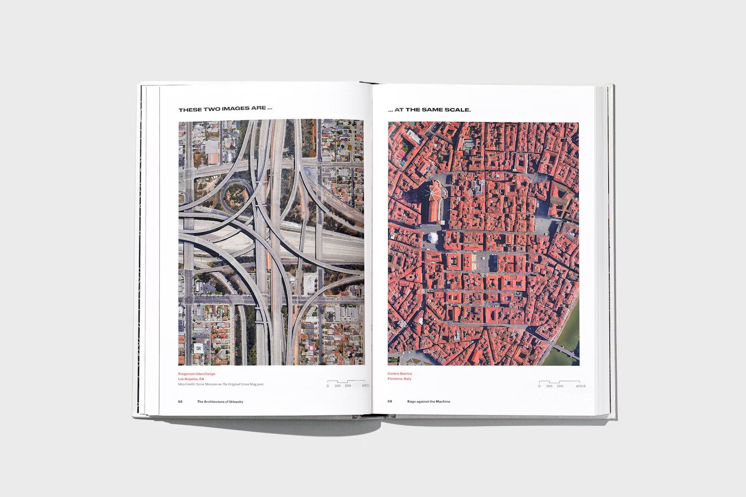
This book is chock full of stuff. From hyper-detailed architectural drawings to complex data visualizations to archival reference imagery and a four-page gatefold timeline, it was no small feat figuring out how to put it all together in a consistent, clear, and approachable way. While my colleagues worried more about the broader structural decisions, I was in the weeds, updating and overhauling charts and graphs, formatting the thorough index of endnotes and image credits, and refining each and every page layout.

A timeline of urban morphology is presented in a four-page gatefold, which I helped arrange.

A chapter full of architectural illustrations, which I cleaned up and recolored for print.
3
The Solution
The book is divided into two parts: DESPAIR and HOPE, denoted by the use of red and cyan blue, respectively. DESPAIR breaks down existential challenges like global warming and political strife, featuring complex, full-spread infographics.
HOPE, on the other hand, investigates how urban design can help solve these problems. It features work by a range of influential architects around the world and explores what makes their work so important. Throughout, type and images are interwoven in a variety of spread layouts, seamlessly connecting the written word with their visual references.


The opening spread of each chapter features more expressive typographic title pages. Britt Cobb designed most, and I helped on a couple.


The cover, which was designed by Britt Cobb, is laminated with a silver metallic sheen.

Working closely with Princeton University to perfect the formatting of the Credits, Endnotes, and Index was a labor of love. I have a newfound respect for publishers and book designers!
Throughout this process, I spend hours and hours making sure rags were balanced just right, checking and double checking for widows and orphans, managing paragraph and character styles, and playing layout Tetris.